Worst looking classic receiver

haha we europeans will totally own the competition in this game! we made the ugliest stereos the world has ever seen!
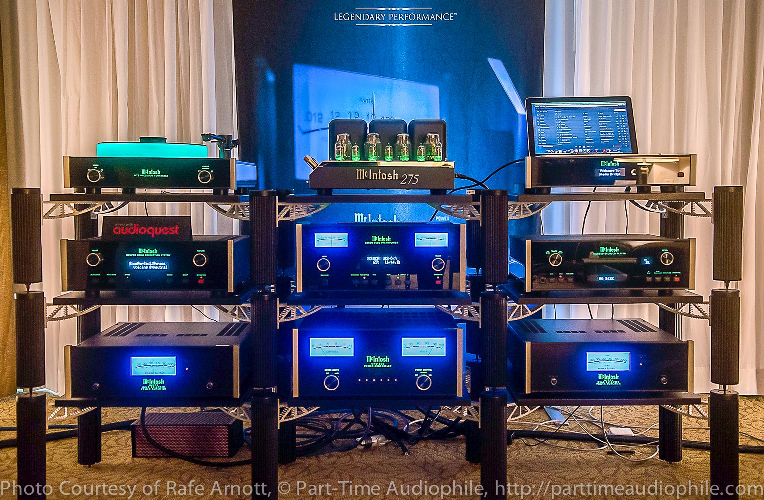
Europeans maybe, but certainly not British, I`d take a british minimalist design over whatever big classic japanese made receiver, never got the hype with those big Vu meters, certainly they don't help sound quality,

QUAD59.jpg


lecson-AC1-AP1-photo1.jpg


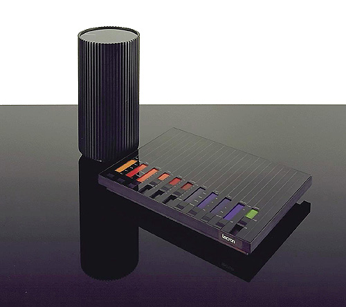
https://www.moma.org/collection/works/2828?locale=en
 
well the british had those wharfdale receivers wich wouldnt qualify here...

but again this one does! the germans shure knew how to make a laughceiver

grundig.jpg
 
I read that the lettering on the TX-2500/4500/6500/8500 can be easily erased while cleaning,not sure if it's the same with the later mk version.
Luckily i saw that before i screwed up my 2500 that i had at one time,missing lettering makes me want to kill.:D

I know the lettering on my JVC JR-S recievers is *famous* for rubbing off... but significantly more common on the silver metal area than the black plastic areas, even though both get rubbed in use.

I ended up replacing some bum lettering with a homemade decal. The result is pretty good as long as you don't look at it at the exact angle that snags the edge of the decal with the light.
 
That Armstrong 626 is a very appealing looking receiver to me. As well as a very fine sounding one.
 
Back
Top Bottom